Duration: 34m 54s | Video: AVC (.mp4) 960×540 29.970 fps | Audio: AAC 48KHz 2ch
Genre: eLearning | Sep 20, 2013 | Level: Beginner | Language: English


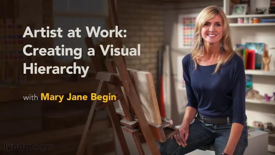
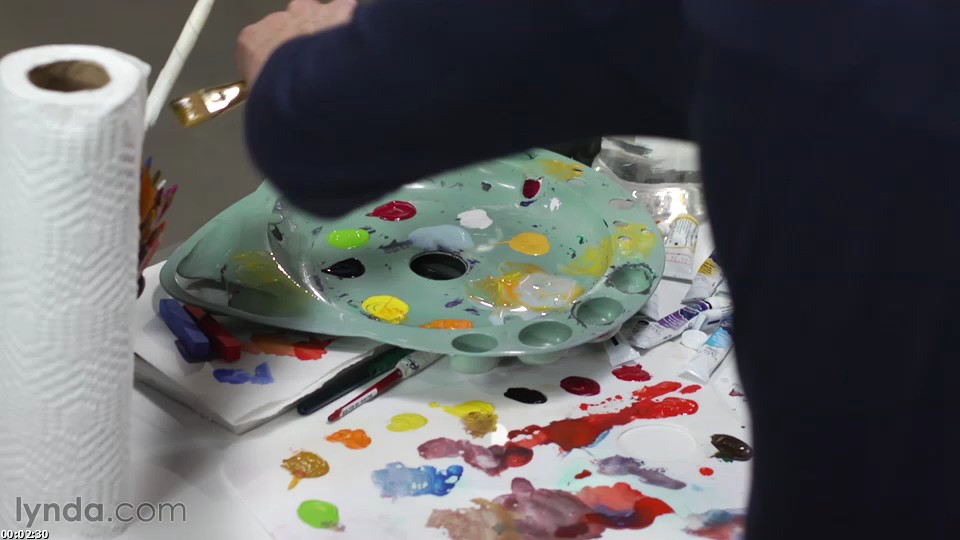
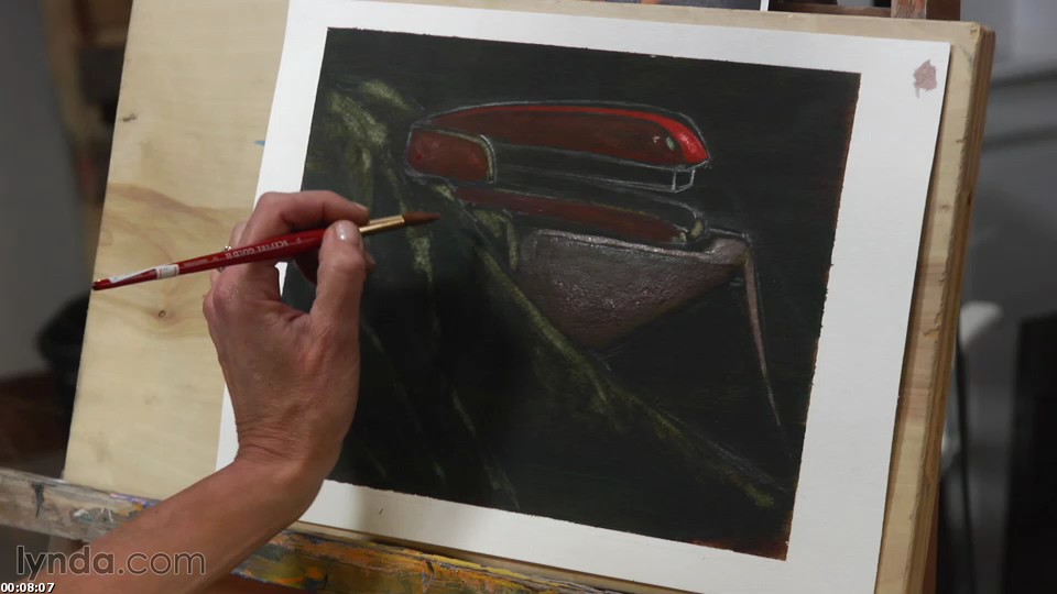
The human eye perceives objects in a scene in order of contrast. Tone, color, and glazing are used to establish this “visual hierarchy” in your art. Join award-winning illustrator and Rhode Island School of Design professor Mary Jane Begin back in her studio as she discusses tricks to achieve visual hierarchy. She starts by establishing value, or light and dark areas in the composition, and then shows how to use varying opacity and a limited color palette to further define the forms in a painting. Finally, learn how glazing can make your colors pop even more and shift the palette toward a warm or cool tone. Mary Jane compares traditional media to a digital workflow while using brushes, sponges, watercolors, and acrylic paint to achieve her results. These lessons can be easily migrated to digital artwork and designs using programs like Adobe Photoshop and Illustrator.
Download uploaded
http://uploaded.net/file/7r286u9g/ArtW_CVisualH.part1.rar
http://uploaded.net/file/j2kqhnqz/ArtW_CVisualH.part2.rar
Download 百度云
你是VIP 1个月(1 month)赞助会员,
转载请注明:0daytown » Artist at Work: Creating a Visual Hierarchy


