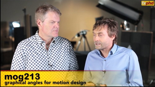
fxphd – MOG213: Graphical Angles for Motion Design
This course, taught by Mark Bowey, is about creating graphical and typographical motion sequences, which are designed to slot in over pre-shot cuts from a short film. So the graphics and live action really merge together to make stunning visual sequences.
We’ll look at generating ideas and style frames to create complimentary and additive graphical moments to overlay onto the footage, as well as choices for typefaces and moods, and blocking-in the sequences with the existing footage. Through AE we’ll add particles and flares and other graphical elements three major sequences, plus a host of other typo tricks and looks… Professor Mark Bowey has a long track record as an Art Director and visual stylist working on features, broadcast design, and even installation projects.
Emmy Award-winner Bowey was Videographics Art Director on two James Bond movies: Die Another Day and Tomorrow Never Dies, as well as Conceptual Graphics Designer on Luc Besson’s The Fifth Element. After moving to Sydney in 2004, has worked for Digital Pictures Sydney, became Omnilab Media’s Creative Director, and also has spent time as an Art Director at Foxtel Design in Sydney, Australia.
class syllabus
Class 1: Project One- an InfoGraphics intro sequence. Creative ideas: all the things we need to put in at the very beginning- before we do too much on-screen work, the ideas, and getting a good angle. This part covers coming up with concepts and research, as well as style framing for proposals- and style positioning. In this first example we will also give out some footage to start this first project.
Class 2: Working up the ideas, selecting the best approach and working on the typo for the InfoGraphics sequence. This will also cover typographical choices, and how to and what needs to be generated in terms of content that can be cleared for commercial usage.
Class 3: Completing this first InfoGraphics sequence, building up typographical layers in 3D and with particles and flares.
Class 4: Project Two- an organic ‘curtain’ of data defining and framing the scene. This is a very typographic motion sequence, with many layers. Again, we will first style frame and come up with ideas for feels and Font choices- showing how visually different the look and effect can be just by changing the typographical approach. Then we will prepare this AE sequence, and give out footage for this segment.
Class 5: Introducing Eddie and ‘hero’ typographic sequences.
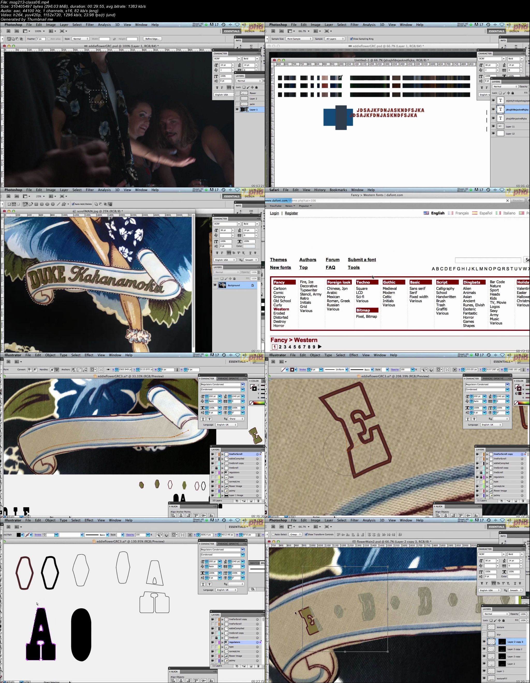
Class 6: Continuing the hero typographic branding for Eddie.
Class 7: Continuing on the ‘curtain’ or wall of data- working with particles and flares, and developing depth in the scene, and looking at any adjustments from inception of brief and style frames to completion.
Class 8: Completion of the data wall sequence and looking at any adjustments from inception of brief and style frames to completion, as well as at other student’s solutions.
Class 9: Mixture of other graphical effects and sequences and typography- making fresh looking titles using space and timing to make typo titles really sing.
Class 10: Polishing last week’s spot with tweaks to Particular, applying them to the Eddie dust shot, and the recap… Final presentation of work on the projects.
http://rg.to/file/7429643b062911c47d4fe15362a9bfe9/FMOG213GAMD.part01.rar.html
http://rg.to/file/00447ca5fdf909f12eca43d7cc189b52/FMOG213GAMD.part02.rar.html
http://rg.to/file/704af2d806947071605c6ca674b673aa/FMOG213GAMD.part03.rar.html
http://rg.to/file/8aa53cf0a93c5a53c6b6c5f758b5f9f5/FMOG213GAMD.part04.rar.html
http://rg.to/file/c5e66a76de54c3deea63e2fa53775ae4/FMOG213GAMD.part05.rar.html
http://rg.to/file/b557f17d333f063c7f147539db2b0d73/FMOG213GAMD.part06.rar.html
http://rg.to/file/6284774526f9a13d884002054091263f/FMOG213GAMD.part07.rar.html
http://rg.to/file/98b5b48e085421b453dd5b493e1be46e/FMOG213GAMD.part08.rar.html
http://rg.to/file/6f988fd22180dc5baf06e82465531f07/FMOG213GAMD.part09.rar.html
http://uploaded.net/file/0wuovyr7/FMOG213GAMD.part01.rar
http://uploaded.net/file/ybiz5ub0/FMOG213GAMD.part02.rar
http://uploaded.net/file/0f2tkg2e/FMOG213GAMD.part03.rar
http://uploaded.net/file/x5x7cd45/FMOG213GAMD.part04.rar
http://uploaded.net/file/r17maoyu/FMOG213GAMD.part05.rar
http://uploaded.net/file/1wggz7wu/FMOG213GAMD.part06.rar
http://uploaded.net/file/245wip1u/FMOG213GAMD.part07.rar
http://uploaded.net/file/1ebubd63/FMOG213GAMD.part08.rar
http://uploaded.net/file/jwq1s1pd/FMOG213GAMD.part09.rar
你是VIP 1个月(1 month)赞助会员,
转载请注明:0daytown » fxphd – MOG213: Graphical Angles for Motion Design
与本文相关的文章
- Python 3 OOP: Master Python Object Oriented Programming
- Python for VLSI Engineer P2 : Understanding COCOTB
- Building Powerful AI Marketing Automation with OpenAI API
- Backend Systems Design
- AUTOSAR Application Software Layer Course (ASWL) | english
- Ultimate Lighting Course – In-Depth Tutorial
- Flutterflow: Le cours complet – Le no code iOS & Android
- Support Vector Machines in Python: SVM Concepts & Code
- Logistic Regression in Python
- RESTful API with Angular & Django: Learn CRUD & AUTH
- Machine Learning Primer with JS: Regression (Math + Code)
- Create Desktop Game For Beginner with Unity Engine & C#