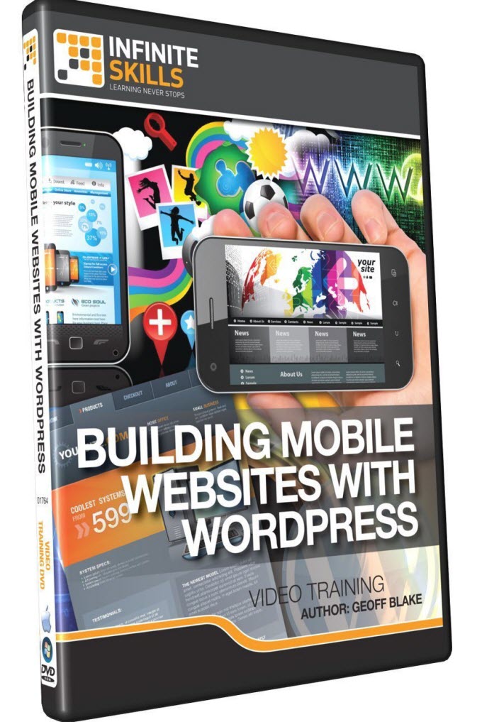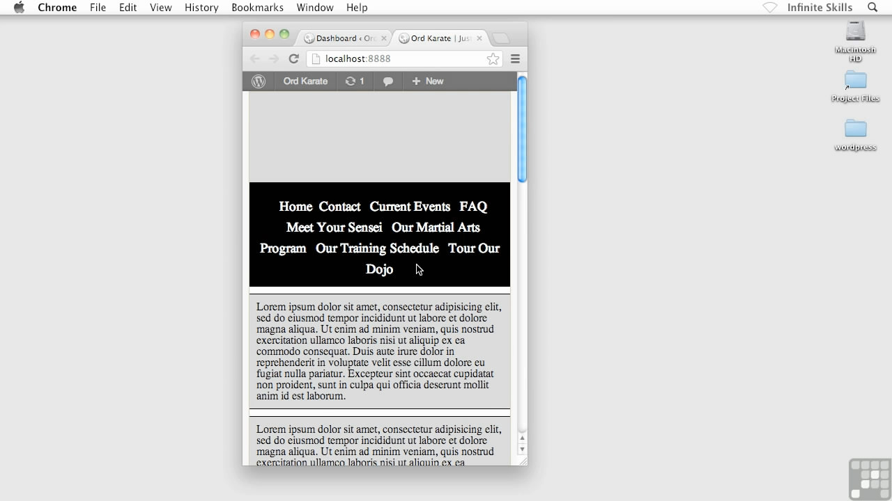
杰夫·布莱克在这个WordPress移动开发培训课程,您将学习如何使用WordPress创建网站,很好看不管是什么设备或屏幕尺寸,你看他们与。 响应的网页设计,使您能够构建和维护一个网站,但它的反应,它是根据设备上观看。 本教程将告诉你如何定制WordPress模板的方式创建一个具有响应性的网站。 WordPress和CSS的一些经验和熟悉建议,为了让您得到最出本次培训。
Flash Video | MP4 / AVC, ~1200 kb/s | 1280×720 | Duration: 3.5 hours | English: AAC, 44.1 KHz (1 ch) | 918 MB
Genre: Development / Programming
| In this WordPress Mobile Development training course from Geoff Blake, you will learn how to create websites using WordPress that look great no matter what device or screen size you are viewing them with. Responsive web design allows you to build and maintain one website, but have it respond according to the device that it is being viewed on. This tutorial will show you how to create a responsive website by way of customizing a WordPress template. Some experience and familiarity with WordPress and CSS is suggested in order for you to get the most out of this training. |
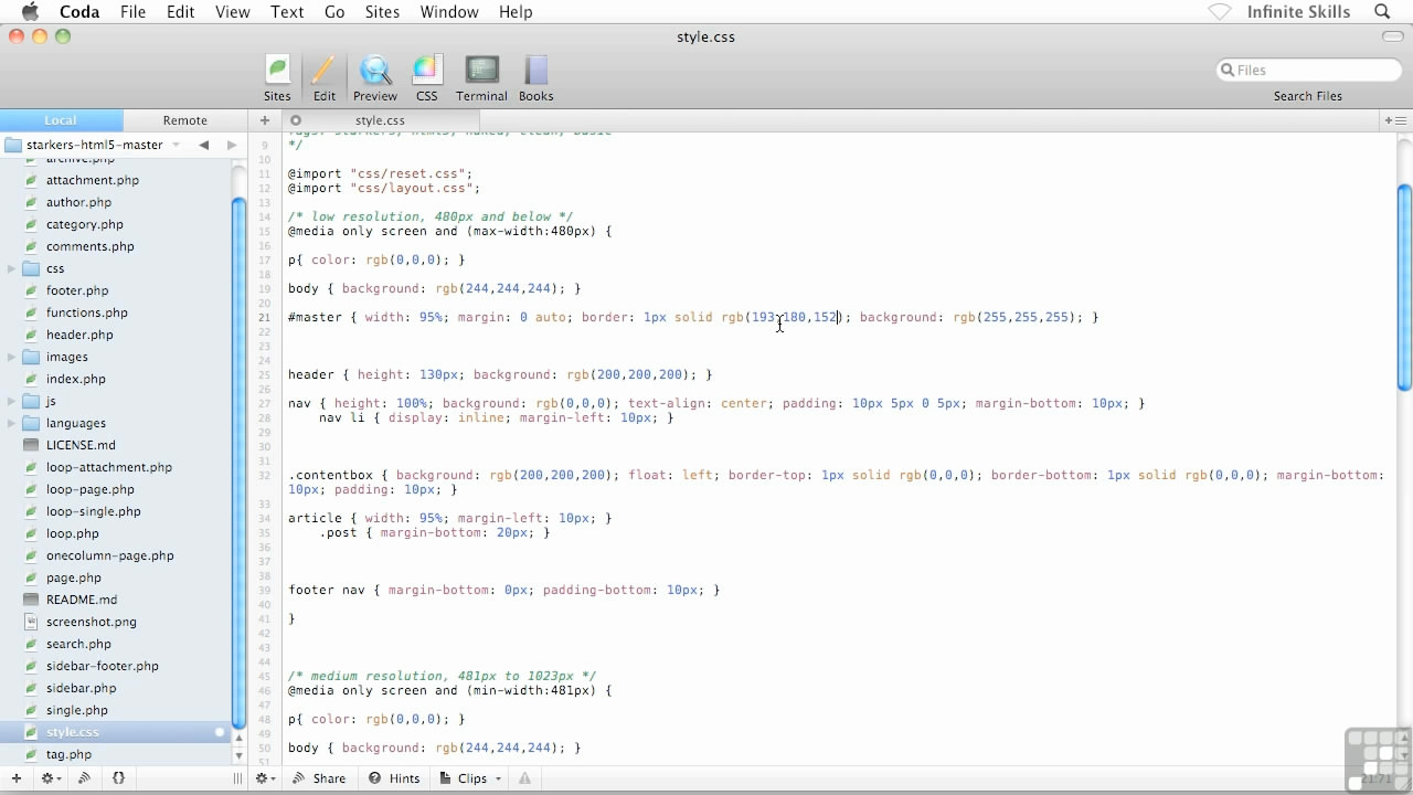
The core of responsive design lies in media queries, and that is where Geoff starts you off. You will learn how to setup media queries using CSS to detect what styles to apply to your website, based on the resolution of the device that is accessing the page. The training videos will show you how to create your high, medium and low resolution designs using wireframing, and then how to hand code each of those designs in WordPress, creating a website that responds to all kinds of mobile devices.
Download uploaded
http://uploaded.net/file/h164twxj/B_Mo_We_with_W.part1.rar
http://uploaded.net/file/14boca7l/B_Mo_We_with_W.part2.rar
http://uploaded.net/file/qs6o3nm8/B_Mo_We_with_W.part3.rar
http://uploaded.net/file/4lngi1ur/B_Mo_We_with_W.part4.rar
Download 城通网盘
B_Mo_We_with_W.part1.rar: http://www.t00y.com/file/29477478
B_Mo_We_with_W.part2.rar: http://www.t00y.com/file/29477479
B_Mo_We_with_W.part3.rar: http://www.t00y.com/file/29477480
B_Mo_We_with_W.part4.rar: http://www.t00y.com/file/29477481
Download 百度云
你是VIP 1个月(1 month)赞助会员,
转载请注明:0daytown » Building Mobile Websites with WordPress Training Video 构建移动网站与WordPress培训视频
与本文相关的文章
- Unreal Engine 5 for Absolute Beginners: Build Subway Surfers
- iOS & Swift: Server/Backend-Driven UI for Dynamic Apps
- Python 3 OOP: Master Python Object Oriented Programming
- Automation Testing Strategies with ASP.NET Core
- Python for VLSI Engineer P2 : Understanding COCOTB
- Adobe Illustrator Essentials: Design Like a Pro in Days
- Building Powerful AI Marketing Automation with OpenAI API
- Creating an Abandoned Church Environment in Unreal Engine 5
- Train Object Detection Models For Android – Java & Kotlin
- Master Next.js for Beginners 2024 with projects
- Backend Systems Design
- AUTOSAR Application Software Layer Course (ASWL) | english
您必须 登录 才能发表评论!

