Size: 220 MB | Duration: 1h 33m | Video: AVC (.mp4) 1280×720 30fps | Audio: AAC 48KHz 2ch
Genre: eLearning | Level: Appropriate for all | Language: English
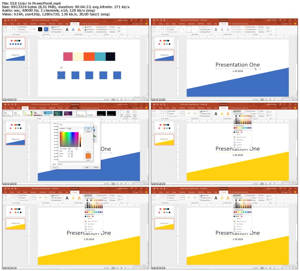
Designed for non-designers, this course introduces average business professionals to key design components and requirements for purposeful PowerPoint slide design. PowerPoint MVP Heather Ackmann avoids convenient—but unproven—blanket rules for presentations, reaching instead for an understanding and holistic view of design. Heather’s approach supports the three basic pillars for effective PowerPoint slides: audience, environment, and message. She guides you through before-and-after examples showing how to properly use white space in slide design, if and when to use bullet points to communicate, how to contrast elements and main ideas effectively, and finally, how to best use color.
* Key design components
* The need for hierarchy
* Hierarchy in bulleted slides
* When bullets are cognitively necessary
* Using space effectively
* Creating similarity and contrast strategically

Download uploaded
http://ul.to/4dbac5oi
Download nitroflare
http://nitroflare.com/view/665E28355CF1D48/LcPwrPntDesignBetterSlides.rar
Download 百度云
链接: https://pan.baidu.com/s/1c1xuKe 密码: 8jxs
转载请注明:0daytown » Lynda – PowerPoint: Designing Better Slides